Last updated on: May 27, 2023
In today’s post, we’re going to look at how to create a popover in Swift.
Popovers are a great way to present additional information or options to the user without taking up too much screen. They are commonly used in macOS apps, and with the introduction of iPadOS, they have become increasingly popular on iPads as well.
Contents
Setting up the Popover
To start, we need to create a view controller that will display the content in the popover.
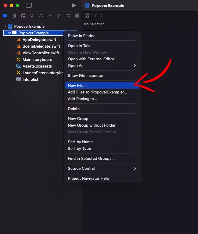
Right-click on your project’s folder in the project navigator and then New File…
Choose Cocoa Touch Class and press Next

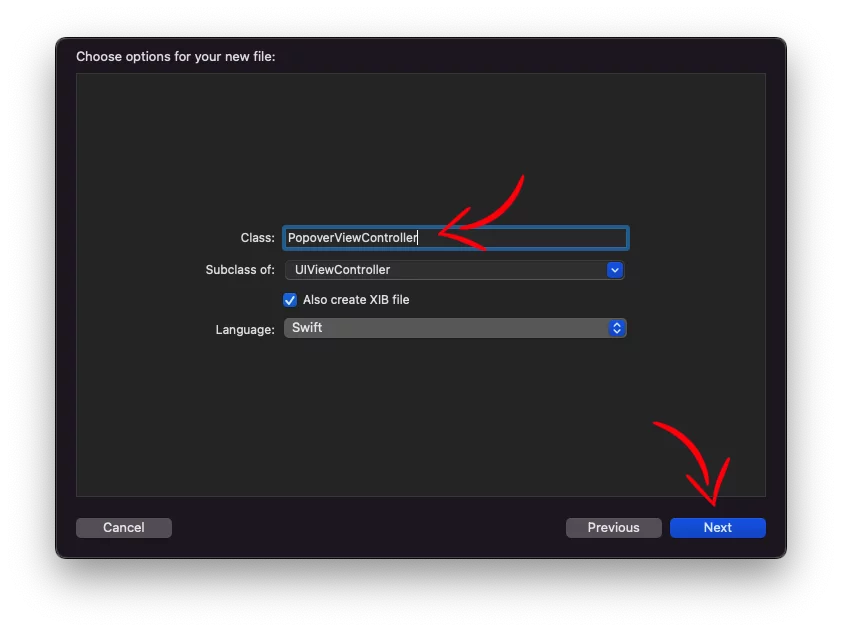
Now, in the new window, give the name “PopoverViewController“ and select the UIViewController as a subclass.
If you would like to use storyboards, select the option Also create a XIB file
Next, we go to the PopoverViewController xib file, and we customize it according to our needs.
In our example, we’re adding a UILabel to display a message and an UIImageView to show an info icon.

In the PopoverViewController swift file, we have a variable named infoText to pass a text we want to display in the popover when it appears.
import UIKit
class PopoverViewController: UIViewController {
var infoText: String
@IBOutlet weak var infoLabel: UILabel!
init(infoText: String) {
self.infoText = infoText
super.init(nibName: "PopoverViewController", bundle: nil)
}
required init?(coder: NSCoder) {
fatalError("init(coder:) has not been implemented")
}
override func viewDidLoad() {
super.viewDidLoad()
infoLabel.text = infoText
}
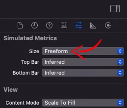
}Code language: Swift (swift)As you see, we’ve selected Freeform as the Size for our layout, and we set the width to 298 and the height to 150, but it doesn’t matter because we’re going to set the size programmatically later, but it’s a good way to do it to get an idea of how it will look.

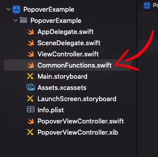
Because you’ll often want to show a popover in different parts of your app, we’ll set up a function that is available everywhere.
In our example, we have a swift file called CommonFunctions. This is where you would place all your global functions in a real app.
Here, we add the code that presents the popover:
import UIKit

func presentPopover(_ parentViewController: UIViewController, _ viewController: UIViewController, sender: UIView, size: CGSize, arrowDirection: UIPopoverArrowDirection = .down) {
    viewController.preferredContentSize = size
    viewController.modalPresentationStyle = .popover
    if let pres = viewController.presentationController {
        pres.delegate = parentViewController
    }
    parentViewController.present(viewController, animated: true)
    if let pop = viewController.popoverPresentationController {
        pop.sourceView = sender
        pop.sourceRect = sender.bounds
        pop.permittedArrowDirections = arrowDirection
    }
}

extension UIViewController: UIPopoverPresentationControllerDelegate {
    public func adaptivePresentationStyle(for controller: UIPresentationController, traitCollection: UITraitCollection) -> UIModalPresentationStyle {
        return .none
    }
}Code language: Swift (swift)
This function takes in five parameters: parentViewController, viewController, sender, size, and arrowDirection.
parentViewControlleris the view controller that will present the popover.viewControlleris the view controller that contains the content of the popover.senderis the view that triggers the display of the popover.sizeis the size of the popover.arrowDirectionis the direction of the arrow that points to thesenderview.
Inside the function, we first set the preferredContentSize property of the viewController to the specified size. We also set the modalPresentationStyle property to .popover to indicate that we want to display a popover.
Next, we set the delegate of the presentationController of the viewController to be the parentViewController. This allows the parent view controller to respond to events related to the presentation of the popover.
Then, we call parentViewController.present(viewController, animated: true) to present the popover.
Finally, we set the sourceView, sourceRect, and permittedArrowDirections properties of the popoverPresentationController of the viewController to display the popover with the correct positioning and arrow direction.
We also have an extension to the UIViewController class that adopts the UIPopoverPresentationControllerDelegate protocol. In this protocol, we override the adaptivePresentationStyle(for:traitCollection:) method to return .none. This allows the popover to be presented in the desired style, without any automatic adjustments by the system.
Showing the Popover
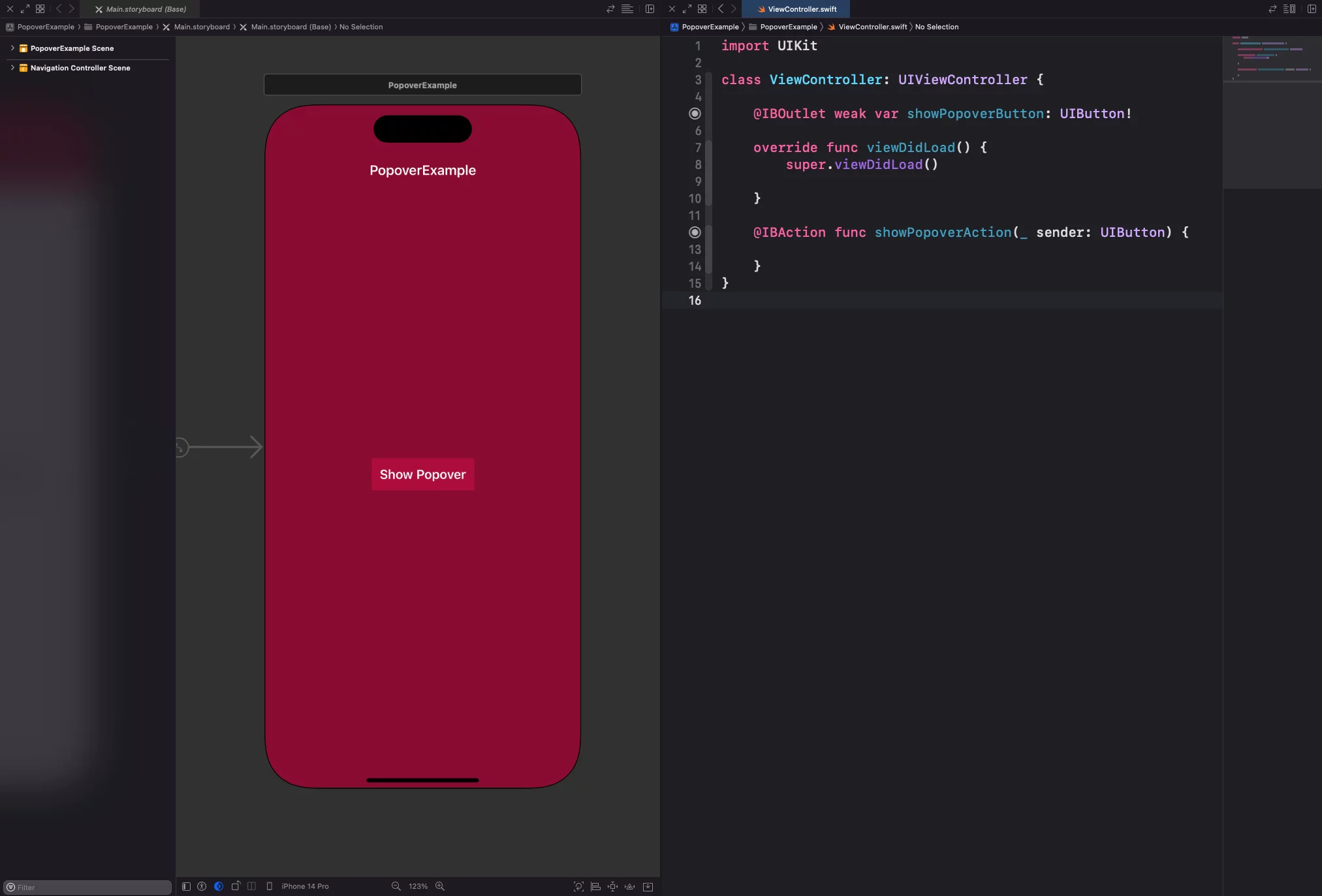
It’s time to show the popover, but we can’t show it without having something to trigger it.
In this example, we add an UIButton in our ViewController, and we define the IBOutlet and the IBAction
NOTE: Keep in mind that you can use the popover in any way you prefer, including within a
UITableViewor aUICollectionView. It’s a versatile feature that can help make your app more interactive and interesting. So, feel free to try it out in different ways to see what works best for you.
Now, we call can display the popover like this:
// ...

@IBAction func showPopoverAction(_ sender: UIButton) {
    let popoverContent = PopoverViewController(infoText: "Username must be between 3-20 and can only consist of alphanumeric characters.")
    presentPopover(self, popoverContent, sender: showPopoverButton, size: CGSize(width: 315, height: 120), arrowDirection: .down)
}

// ...
Code language: Swift (swift)
Inside the function, we create a new instance of PopoverViewController.
The PopoverViewController takes an infoText string parameter, which we use to display some information to the user in the popover.
Next, the presentPopover function is called with several parameters:
self: This refers to the current view controller, which is the view controller that is presenting the popover.popoverContent: This is thePopoverViewControllerinstance that was created earlier, and is the view controller that will be presented in the popover.sender: This refers to theUIButtonthat triggered the function, and is used to determine where the popover should be positioned.CGSize(width: 315, height: 120): This sets the size of the popover to be 315 pixels wide and 120 pixels high..down: This specifies that the arrow of the popover should point downwards.
You can find the final project here
If you have any questions, please feel free to leave a comment below