Last updated on: May 27, 2023
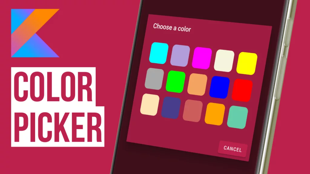
In this tutorial, I’m going to show you how to make a color picker. It’s a pretty cool feature that lets users pick a color from a grid that we’ll pre-fill with different color options.
Contents
Implementing the Color Adapter
First, we need to set up an adapter for our RecyclerView. This adapter will hold the colors that the user can choose from.
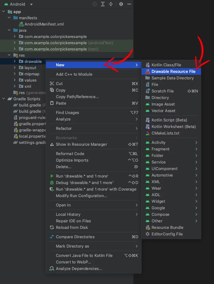
Right-click on the package, then go to New > Kotlin Class/File.
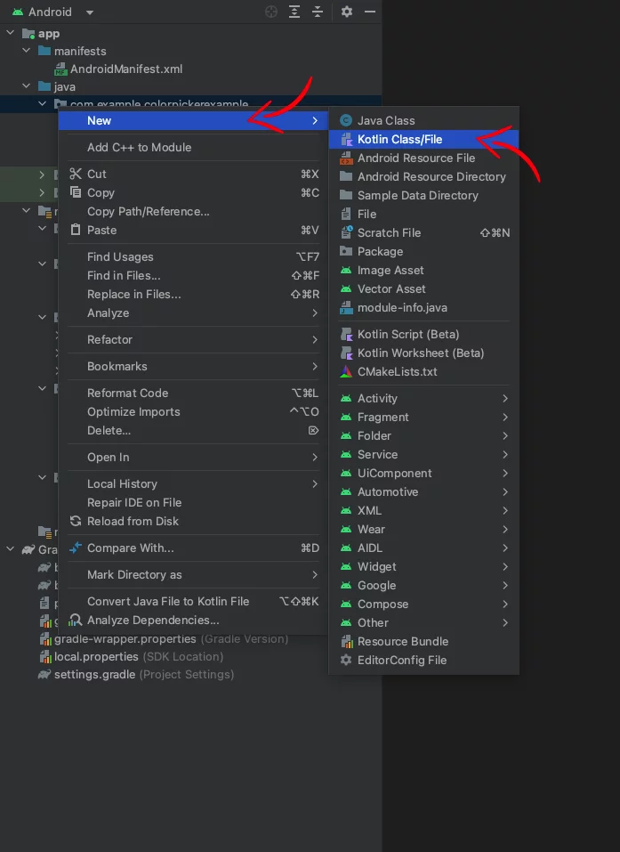
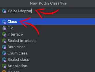
In the popup window, select Class.
In the name field, type ‘ColorAdapter‘ and then click OK.
Now, inside the newly created ColorAdapter.kt file, paste the following code:
class ColorAdapter(
    private val context: Context,
    private val colors: List<Int>,
    private val onItemClick: (Int) -> Unit
) : RecyclerView.Adapter<ColorAdapter.ColorViewHolder>() {

    inner class ColorViewHolder(itemView: View) : RecyclerView.ViewHolder(itemView) {
        private val colorView: View = itemView.findViewById(R.id.colorView)

        fun bind(color: Int) {
            val backgroundDrawable = ContextCompat.getDrawable(context, R.drawable.square_rounded_corners)?.mutate()
            backgroundDrawable?.colorFilter = PorterDuffColorFilter(color, PorterDuff.Mode.SRC_IN)
            colorView.background = backgroundDrawable
            itemView.setOnClickListener { onItemClick(color) }
        }
    }

    override fun onCreateViewHolder(parent: ViewGroup, viewType: Int): ColorViewHolder {
        val inflater = LayoutInflater.from(context)
        val view = inflater.inflate(R.layout.color_item, parent, false)
        return ColorViewHolder(view)
    }

    override fun onBindViewHolder(holder: ColorViewHolder, position: Int) {
        val color = colors[position]
        holder.bind(color)
    }

    override fun getItemCount(): Int {
        return colors.size
    }
}Code language: Kotlin (kotlin)
This adapter has an onItemClick function that is triggered when a color is selected.
Creating the Layouts
We need three XML files for this project:
activity_main.xmlfor our main activity layout.color_item.xmlfor each individual color item in the RecyclerView.square_rounded_corners.xmlfor a drawable that we’ll use as the background of each color item.
Designing the MainActivity Layout
The main activity layout is fairly simple. It features a single button that, when clicked, will trigger the display of the color picker.
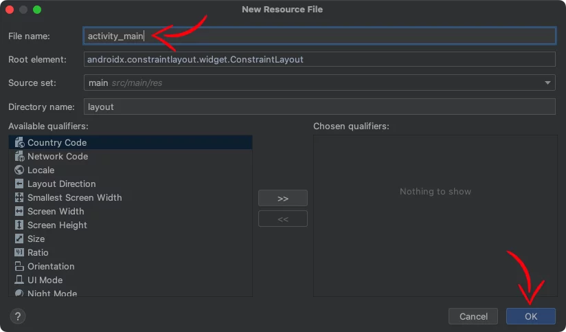
Right-click on the layout folder, select New > Layout resource file.
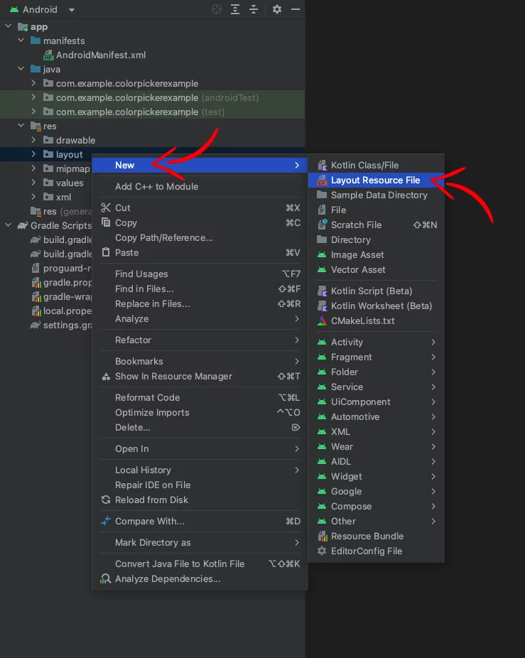
In the New Resource File dialog box that appears, name the file as activity_main and click OK.
In the activity_main.xml file, add the following code:
<?xml version="1.0" encoding="utf-8"?>
<androidx.constraintlayout.widget.ConstraintLayout xmlns:android="http://schemas.android.com/apk/res/android"
    xmlns:app="http://schemas.android.com/apk/res-auto"
    xmlns:tools="http://schemas.android.com/tools"
    android:id="@+id/content"
    android:layout_width="match_parent"
    android:layout_height="match_parent"
    android:background="@color/colorPrimaryDark"
    tools:context=".MainActivity">

    <Button
        android:id="@+id/color_picker_button"
        android:layout_width="wrap_content"
        android:layout_height="wrap_content"
        android:background="@color/colorPrimary"
        android:padding="10dp"
        android:text="Pick Color"
        android:textAllCaps="false"
        android:textColor="@android:color/white"
        android:textStyle="normal"
        app:layout_constraintBottom_toBottomOf="parent"
        app:layout_constraintEnd_toEndOf="parent"
        app:layout_constraintStart_toStartOf="parent"
        app:layout_constraintTop_toTopOf="parent" />

</androidx.constraintlayout.widget.ConstraintLayout>Code language: HTML, XML (xml)
The layout’s id (@+id/content) will be used later to change the background color dynamically.
Creating the Color Item Layout
Next, we’ll design the layout for each color item in our grid. Each item is a square view with rounded corners, housed within a ConstraintLayout. The aspect ratio is set to 1:1, ensuring the view remains a perfect square regardless of its size. The background drawable (@drawable/square_rounded_corners) will be used to apply the color dynamically.
Like we did before with the activity_main.xml, create a new layout resource file and name it color_item.xml.
After that, paste the following code inside:
<?xml version="1.0" encoding="utf-8"?>
<androidx.constraintlayout.widget.ConstraintLayout xmlns:android="http://schemas.android.com/apk/res/android"
    xmlns:app="http://schemas.android.com/apk/res-auto"
    android:layout_width="match_parent"
    android:layout_height="wrap_content">

    <View
        android:id="@+id/colorView"
        android:layout_width="0dp"
        android:layout_height="0dp"
        android:background="@drawable/square_rounded_corners"
        app:layout_constraintDimensionRatio="1:1"
        app:layout_constraintEnd_toEndOf="parent"
        app:layout_constraintStart_toStartOf="parent"
        app:layout_constraintTop_toTopOf="parent" />

</androidx.constraintlayout.widget.ConstraintLayout>Code language: HTML, XML (xml)
Making a Shape Drawable
Finally, we create a drawable with rounded corners that will be used as the background for the color item view. This drawable has a solid color which will be changed dynamically for each item in the color grid.
Right-click on the drawable folder, select New > Drawable resource file.
In the New Resource File dialog box that appears, name the file as square_rounded_corners and click OK.

In the square_rounded_corners.xml file, paste the following:
<?xml version="1.0" encoding="utf-8"?>
<shape xmlns:android="http://schemas.android.com/apk/res/android">
    <solid android:color="#FFFFFF" />
    <corners android:radius="12dp" />
</shape>Code language: HTML, XML (xml)
Adding Grid Spacing
We want to display our colors in a grid format. To achieve this, we will create a GridSpacingItemDecoration class that will add spacing between our items.
Create a new Kotlin file named GridSpacingItemDecoration.kt and paste the following code:
class GridSpacingItemDecoration(
    private val spanCount: Int,
    private val spacing: Int,
    private val includeEdge: Boolean
) : RecyclerView.ItemDecoration() {

    override fun getItemOffsets(
        outRect: Rect,
        view: View,
        parent: RecyclerView,
        state: RecyclerView.State
    ) {
        val position = parent.getChildAdapterPosition(view) // item position
        val column = position % spanCount // item column

        val leftSpacing = spacing - column * spacing / spanCount
        val rightSpacing = (column + 1) * spacing / spanCount

        if (includeEdge) {
            outRect.left = leftSpacing
            outRect.right = rightSpacing

            if (position < spanCount) { // top edge
                outRect.top = spacing
            }
            outRect.bottom = spacing // item bottom
        } else {
            outRect.left = column * spacing / spanCount
            outRect.right = spacing - (column + 1) * spacing / spanCount
            if (position >= spanCount) {
                outRect.top = spacing // item top
            }
        }
    }
}Code language: Kotlin (kotlin)
Showing the Color Picker Dialog
Now that we have our layouts and adapters in place, let’s display them in an AlertDialog when the button is clicked. This will be done in our MainActivity.
class MainActivity : AppCompatActivity() {

    private lateinit var colorPickerDialog: AlertDialog
    private lateinit var content: ConstraintLayout

    override fun onCreate(savedInstanceState: Bundle?) {
        super.onCreate(savedInstanceState)
        setContentView(R.layout.activity_main)

        content = findViewById(R.id.content)
        val colorPickerButton: Button = findViewById(R.id.color_picker_button)
        colorPickerButton.setOnClickListener { showColorPickerDialog() }
    }

    private fun showColorPickerDialog() {

        val colors = listOf(
            Color.CYAN, Color.rgb(179, 157, 219), Color.MAGENTA, Color.rgb(245, 245, 220), Color.YELLOW,
            Color.rgb(169, 169, 169), Color.GREEN, Color.rgb(244, 164, 96), Color.BLUE, Color.RED,
            Color.rgb(255, 228, 181), Color.rgb(72, 61, 139), Color.rgb(205, 92, 92), Color.rgb(255, 165, 0), Color.rgb(102, 205, 170)
        )

        val numColumns = 5 // Desired number of columns
        val padding = dpToPx(15) // Convert 15 dp to pixels
        val spacing = dpToPx(15) // Set the spacing between items in dp

        val recyclerView = RecyclerView(this).apply {
            layoutParams = ViewGroup.LayoutParams(
                ViewGroup.LayoutParams.MATCH_PARENT,
                ViewGroup.LayoutParams.MATCH_PARENT
            )
            layoutManager = GridLayoutManager(this@MainActivity, numColumns)
            setPadding(padding, dpToPx(20), padding, padding) // Convert padding to pixels
            adapter = ColorAdapter(this@MainActivity, colors) { selectedColor ->
                // Do something with the selected color

                // Change Background Color
                content.setBackgroundColor(selectedColor)
                // Change the App Bar Background Color
                supportActionBar?.setBackgroundDrawable(ColorDrawable(selectedColor))

                colorPickerDialog.dismiss()
            }
            addItemDecoration(GridSpacingItemDecoration(numColumns, spacing, true))
        }

        colorPickerDialog = AlertDialog.Builder(this, R.style.CustomAlertDialogTheme)
            .setTitle("Choose a color")
            .setView(recyclerView)
            .setNegativeButton("Cancel") { dialog, _ ->
                dialog.dismiss()
            }
            .create()
        colorPickerDialog.show()
    }

    private fun dpToPx(dp: Int): Int {
        return (dp * resources.displayMetrics.density).toInt()
    }
}Code language: Kotlin (kotlin)
In this example, we prepare the AlertDialog by setting its view to our RecyclerView, and display it when the color picker button is clicked.
When a color is selected from the RecyclerView, the color of the background, the ActionBar, and the status bar will change to the selected color.
You can find the final project here
If you have any questions, please feel free to leave a comment below