
Last updated on: May 27, 2023
In this tutorial, I’ll show you how to make a PickerView using the WheelView by wangjiegulu
If you’re not familiar with iOS development, probably you never heard the word PickerView before.
With PickerView you can display the data in rows and you scroll up and down to select the item, and often has a Cancel and a Done button.
Let’s create the same for Android!
Contents
Creating the WheelView custom class
Create a new Kotlin class, give the name WheelView.kt, and paste the following code inside:
/**
* Author: wangjie
* Email: tiantian.china.2@gmail.com
* Date: 7/1/14.
*
* Edited by John Codeos
*/
class WheelView : ScrollView {
private lateinit var mContext: Context
private lateinit var views: LinearLayout
private var items: MutableList<String>? = null
var offset = OFF_SET_DEFAULT
var linesColor: Int = Color.YELLOW
var selectedItemColor: Int = Color.YELLOW
var unselectedItemColor: Int = Color.YELLOW
var itemFont: Typeface? = null
var itemTextSize: Float = 25f
private var displayItemCount: Int = 0
private var selectedIndex = 1
private var initialY: Int = 0
private lateinit var scrollerTask: Runnable
private var newCheck = 50
private var itemHeight = 0
private var selectedAreaBorder: IntArray? = null
private var scrollDirection = -1
internal var paint: Paint? = null
internal var viewWidth: Int = 0
val getSelectedItem: String
get() = items!![selectedIndex]
val getSelectedIndex: Int
get() {
return selectedIndex - offset
}
lateinit var onWheelViewListener: OnWheelViewListener
open class OnWheelViewListener {
open fun onSelected(selectedIndex: Int, item: String) {}
}
constructor(context: Context) : super(context) {
init(context)
}
constructor(context: Context, attrs: AttributeSet) : super(context, attrs) {
init(context)
}
constructor(context: Context, attrs: AttributeSet, defStyle: Int) : super(
context,
attrs,
defStyle
) {
init(context)
}
private fun getItems(): List<String>? {
return items
}
fun setItems(list: List<String>) {
if (null == items) {
items = ArrayList()
}
items!!.clear()
items!!.addAll(list)
for (i in 0 until offset) {
items!!.add(0, "")
items!!.add("")
}
initData()
}
private fun init(context: Context) {
mContext = context
this.isVerticalScrollBarEnabled = false
views = LinearLayout(context)
views.orientation = LinearLayout.VERTICAL
this.addView(views)
scrollerTask = Runnable {
val newY = scrollY
if (initialY - newY == 0) { // stopped
val remainder = initialY % itemHeight
val divided = initialY / itemHeight
if (remainder == 0) {
selectedIndex = divided + offset
onSelectedCallBack()
} else {
if (remainder > itemHeight / 2) {
post {
smoothScrollTo(0, initialY - remainder + itemHeight)
selectedIndex = divided + offset + 1
onSelectedCallBack()
}
} else {
post {
smoothScrollTo(0, initialY - remainder)
selectedIndex = divided + offset
onSelectedCallBack()
}
}
}
} else {
initialY = scrollY
postDelayed(scrollerTask, newCheck.toLong())
}
}
}
private fun startScrollerTask() {
initialY = scrollY
postDelayed(scrollerTask, newCheck.toLong())
}
private fun initData() {
displayItemCount = offset * 2 + 1
for (item in items!!) {
views.addView(createView(item))
}
refreshItemView(0)
}
private fun createView(item: String): TextView {
val textView = TextView(context)
textView.layoutParams = LayoutParams(
ViewGroup.LayoutParams.MATCH_PARENT,
ViewGroup.LayoutParams.WRAP_CONTENT
)
textView.isSingleLine = true
textView.typeface = itemFont
textView.typeface = null
textView.setTextSize(TypedValue.COMPLEX_UNIT_SP, itemTextSize)
textView.text = item
textView.gravity = Gravity.CENTER
val padding = dip2px(15f)
textView.setPadding(padding, padding, padding, padding)
if (0 == itemHeight) {
itemHeight = getViewMeasuredHeight(textView)
views.layoutParams = LayoutParams(
ViewGroup.LayoutParams.MATCH_PARENT,
itemHeight * displayItemCount
)
val lp = this.layoutParams as LinearLayout.LayoutParams
layoutParams = LinearLayout.LayoutParams(lp.width, itemHeight * displayItemCount)
}
return textView
}
override fun onScrollChanged(l: Int, t: Int, oldl: Int, oldt: Int) {
super.onScrollChanged(l, t, oldl, oldt)
refreshItemView(t)
scrollDirection = if (t > oldt) {
SCROLL_DIRECTION_DOWN
} else {
SCROLL_DIRECTION_UP
}
}
private fun refreshItemView(y: Int) {
var position = y / itemHeight + offset
val remainder = y % itemHeight
val divided = y / itemHeight
if (remainder == 0) {
position = divided + offset
} else {
if (remainder > itemHeight / 2) {
position = divided + offset + 1
}
}
val childSize = views.childCount
for (i in 0 until childSize) {
val itemView = views.getChildAt(i) as TextView
itemView.setTypeface(null, Typeface.BOLD)
if (position == i) {
itemView.setTextColor(selectedItemColor) // Selected Item Text Color
itemView.alpha = 1f
} else {
itemView.setTextColor(unselectedItemColor) // Unselected Item Text Color
itemView.alpha = 0.6f
}
}
}
private fun obtainSelectedAreaBorder(): IntArray {
if (null == selectedAreaBorder) {
selectedAreaBorder = IntArray(2)
selectedAreaBorder!![0] = itemHeight * offset
selectedAreaBorder!![1] = itemHeight * (offset + 1)
}
return selectedAreaBorder as IntArray
}
override fun setBackground(background: Drawable?) {
if (viewWidth == 0) {
val displayMetrics = DisplayMetrics()
(context as Activity).windowManager.defaultDisplay.getMetrics(displayMetrics)
val screenWidth = displayMetrics.widthPixels
}
if (null == paint) {
paint = Paint()
paint?.color = linesColor //Lines Color
paint?.strokeWidth = dip2px(1f).toFloat()
}
val drawable = object : Drawable() {
override fun draw(canvas: Canvas) {
canvas.drawLine(
(viewWidth * 1 / 6).toFloat(),
obtainSelectedAreaBorder()[0].toFloat(),
(viewWidth * 5 / 6).toFloat(),
obtainSelectedAreaBorder()[0].toFloat(),
paint!!
)
canvas.drawLine(
(viewWidth * 1 / 6).toFloat(),
obtainSelectedAreaBorder()[1].toFloat(),
(viewWidth * 5 / 6).toFloat(),
obtainSelectedAreaBorder()[1].toFloat(),
paint!!
)
}
override fun setAlpha(alpha: Int) {}
override fun setColorFilter(cf: ColorFilter?) {}
@SuppressWarnings("deprecation")
override fun getOpacity(): Int {
return PixelFormat.UNKNOWN
}
}
super.setBackground(drawable)
}
override fun onSizeChanged(w: Int, h: Int, oldw: Int, oldh: Int) {
super.onSizeChanged(w, h, oldw, oldh)
viewWidth = w
background = null
}
private fun onSelectedCallBack() {
onWheelViewListener.onSelected(selectedIndex, items!![selectedIndex])
}
fun setSelection(position: Int) {
selectedIndex = position + offset
this.post { this@WheelView.smoothScrollTo(0, position * itemHeight) }
}
override fun fling(velocityY: Int) {
super.fling(velocityY / 3)
}
override fun onTouchEvent(ev: MotionEvent): Boolean {
if (ev.action == MotionEvent.ACTION_UP) {
startScrollerTask()
}
return super.onTouchEvent(ev)
}
private fun dip2px(dpValue: Float): Int {
val scale = context?.resources?.displayMetrics?.density
return (dpValue * scale!! + 0.5f).toInt()
}
private fun getViewMeasuredHeight(view: View): Int {
val width = MeasureSpec.makeMeasureSpec(0, MeasureSpec.UNSPECIFIED)
val expandSpec =
MeasureSpec.makeMeasureSpec(Integer.MAX_VALUE shr 2, MeasureSpec.AT_MOST)
view.measure(width, expandSpec)
return view.measuredHeight
}
companion object {
const val OFF_SET_DEFAULT = 1
private const val SCROLL_DIRECTION_UP = 0
private const val SCROLL_DIRECTION_DOWN = 1
}
}Code language: Kotlin (kotlin)Creating the PickerView Activity
To show the PickerView, we use an Activity that has a semi-transparent background, and the PickerView (WheelView + 2 Buttons) are rising from the bottom of the screen.
Create a new empty Activity and name it PickerViewActivity.kt


Go to res > values > styles.xml and add the theme for the PickerViewActivity
<resources xmlns:tools="http://schemas.android.com/tools">

    <!-- Other Themes -->

    <style name="PickerViewActivityTheme" parent="Theme.AppCompat.Light.NoActionBar">
        <item name="android:windowBackground">@android:color/transparent</item>
    </style>


</resources>Code language: HTML, XML (xml)
And add the theme to the PickerViewActivity in the AndroidManifest.xml (manifests > AndroidManifest.xml)
<manifest xmlns:android="http://schemas.android.com/apk/res/android"
    package="com.example.pickerviewexample">

    <application
        android:allowBackup="true"
        android:icon="@mipmap/ic_launcher"
        android:label="@string/app_name"
        android:roundIcon="@mipmap/ic_launcher_round"
        android:supportsRtl="true"
        android:theme="@style/AppTheme">
        <activity
            android:name=".PickerViewActivity"
            android:exported="false"
            android:theme="@style/PickerViewActivityTheme" />

         <!-- MainActivity -->

    </application>

</manifest>Code language: HTML, XML (xml)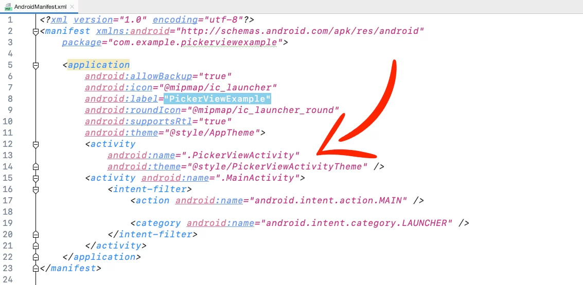
Go to the layout of the PickerViewActivity, activity_picker_view.xml, and paste:
<?xml version="1.0" encoding="utf-8"?>
<RelativeLayout xmlns:android="http://schemas.android.com/apk/res/android"
    xmlns:tools="http://schemas.android.com/tools"
    android:id="@+id/picker_view_transparent_bg"
    android:layout_width="match_parent"
    android:layout_height="match_parent"
    android:layout_alignParentBottom="true"
    android:background="@android:color/transparent"
    tools:context=".MainActivity">

    <LinearLayout
        android:id="@+id/picker_view_bg"
        android:layout_width="match_parent"
        android:layout_height="wrap_content"
        android:layout_alignParentStart="true"
        android:layout_alignParentBottom="true"
        android:background="@color/colorPrimary"
        android:gravity="bottom"
        android:orientation="vertical">

        <RelativeLayout
            android:id="@+id/bar_view"
            android:layout_width="match_parent"
            android:layout_height="40dp"
            android:background="@color/colorPrimaryDark">


            <Button
                android:id="@+id/cancel_button"
                android:layout_width="wrap_content"
                android:layout_height="match_parent"
                android:background="@android:color/transparent"
                android:gravity="center"
                android:paddingStart="10dp"
                android:paddingEnd="10dp"
                android:text="Cancel"
                android:textAllCaps="false"
                android:textColor="@android:color/white"
                android:textStyle="bold" />

            <Button
                android:id="@+id/done_button"
                android:layout_width="wrap_content"
                android:layout_height="match_parent"
                android:layout_alignParentEnd="true"
                android:background="@android:color/transparent"
                android:gravity="center"
                android:paddingStart="10dp"
                android:paddingEnd="10dp"
                android:text="Done"
                android:textAllCaps="false"
                android:textColor="@android:color/white"
                android:textStyle="bold" />

        </RelativeLayout>


        <com.example.pickerviewexample.WheelView
            android:id="@+id/wheel_view"
            android:layout_width="match_parent"
            android:layout_height="300dp" />

    </LinearLayout>


</RelativeLayout>Code language: HTML, XML (xml)
In the PickerViewActivity.kt, declare two variables, the String selectedItem to keep the selected item from the PickerView, and an Int selectedItemPosition for the position.
Also, initialize the Boolean statusBarDark
- true = Dark status bar icons
- false = Light status bar icons
class PickerViewActivity() : AppCompatActivity() {

    private var selectedItem = ""
    private var selectedItemPosition = 0

    var statusBarDark = false

    // ...

}Code language: Swift (swift)
Add the list with the data you want to display in the PickerView, in this example, we show a list with years between 2010-2020.
class PickerViewActivity() : AppCompatActivity() {

    // ...

    private var yearList = mutableListOf(
        "2022"
        "2021",
        "2020",
        "2019",
        "2018",
        "2017",
        "2016",
        "2015",
        "2014",
        "2013",
        "2012",
        "2011",
        "2010"
    )


    // ...
}Code language: Swift (swift)
Create 2 methods for the slide up (slideUp) and slide down (slideDown) animation of the pickerView
class PickerViewActivity() : AppCompatActivity() {

    // ...

    // Slide the view from its current position to below itself
    private fun slideUp(view: View) {
        ObjectAnimator.ofFloat(view, "translationY", 0f).apply {
            duration = 600
            start()
        }
    }

    // Slide the view from below itself to the current position
    private fun slideDown(view: View) {
        val mDisplay = windowManager.defaultDisplay
        val mDisplaySize = Point()
        mDisplay.getSize(mDisplaySize)
        val maxY = mDisplaySize.y
        val animation = ObjectAnimator.ofFloat(view, "translationY", maxY.toFloat())
        animation.duration = 600
        animation.start()
    }

    // ...

}
Code language: Kotlin (kotlin)
Remove the default open/close animation from the Activity because we’re going to use a fade animation later
class PickerViewActivity() : AppCompatActivity() {

    // ...

    override fun onCreate(savedInstanceState: Bundle?) {
        super.onCreate(savedInstanceState)

        // Remove Open/Close Activity Animations
        overridePendingTransition(0, 0)
        setContentView(R.layout.activity_picker_view)


        // ...

   }

   // ...

}Code language: Kotlin (kotlin)
Set the window flags for the Activity
class PickerViewActivity() : AppCompatActivity() {


    // ...


    override fun onCreate(savedInstanceState: Bundle?) {
        super.onCreate(savedInstanceState)

        // ...


        window.decorView.systemUiVisibility =
            View.SYSTEM_UI_FLAG_LAYOUT_STABLE or View.SYSTEM_UI_FLAG_LAYOUT_FULLSCREEN

        // Show dark status bar or not
        if (statusBarDark) {
            this.window.decorView.systemUiVisibility =
                View.SYSTEM_UI_FLAG_LAYOUT_FULLSCREEN or View.SYSTEM_UI_FLAG_LIGHT_STATUS_BAR
        }
        this.window.statusBarColor = Color.TRANSPARENT
        setWindowFlag(this, false)

        // ...

    }

    // ...

    private fun setWindowFlag(activity: Activity, on: Boolean) {
        val win = activity.window
        val winParams = win.attributes
        if (on) {
            winParams.flags = winParams.flags or WindowManager.LayoutParams.FLAG_TRANSLUCENT_STATUS
        } else {
            winParams.flags =
                winParams.flags and WindowManager.LayoutParams.FLAG_TRANSLUCENT_STATUS.inv()
        }
        win.attributes = winParams
    }

    // ...
}
Code language: Kotlin (kotlin)
Make the semi-transparent background of the Activity fade in/fade out when you open/close the PickerViewActivity
class PickerViewActivity() : AppCompatActivity() {

    // ...

    private lateinit var pickerViewTransparentBg: RelativeLayout
    private lateinit var pickerViewBg: LinearLayout

    override fun onCreate(savedInstanceState: Bundle?) {
        super.onCreate(savedInstanceState)

        // ...

        pickerViewTransparentBg = findViewById(R.id.picker_view_transparent_bg)
        pickerViewBg = findViewById(R.id.picker_view_bg)

        // Fade Animation for the Semi-Transparent Black Background
        // Get the size of the size
        val mDisplay = windowManager.defaultDisplay
        val mDisplaySize = Point()
        mDisplay.getSize(mDisplaySize)
        val maxX = mDisplaySize.x
        val maxY = mDisplaySize.y

        // Set the background same as Display height
        pickerViewBg.y = maxY.toFloat()
        val alpha = 85 // Set Between 0-255
        val alphaColor = ColorUtils.setAlphaComponent(Color.BLACK, alpha)
        val colorAnimation = ValueAnimator.ofObject(ArgbEvaluator(), Color.TRANSPARENT, alphaColor)
        colorAnimation.duration = 500 // milliseconds
        colorAnimation.addUpdateListener { animator -> pickerViewTransparentBg.setBackgroundColor(animator.animatedValue as Int) }
        colorAnimation.start()


        // ...
    }

    override fun onBackPressed() {
        // Fade-Out Animation the Semi-Transparent Black Background
        // Close PickerView with slide down animation
        val alpha = 85 //between 0-255
        val alphaColor = ColorUtils.setAlphaComponent(Color.BLACK, alpha)
        val colorAnimation = ValueAnimator.ofObject(ArgbEvaluator(), alphaColor, Color.TRANSPARENT)
        colorAnimation.duration = 500 // milliseconds
        colorAnimation.addUpdateListener { animator -> pickerViewTransparentBg.setBackgroundColor(animator.animatedValue as Int) }
        slideDown(pickerViewBg)
        colorAnimation.addListener(object : AnimatorListenerAdapter() {
            override fun onAnimationEnd(animation: Animator) {
                finish()
                overridePendingTransition(0, 0)
            }
        })
        colorAnimation.start()
    }

    // ...

}
Code language: Kotlin (kotlin)
Customize, add the items in the PickerView, return the currently selected item and the position, and add a listener for the ‘Cancel‘ and ‘Done‘ buttons.
class PickerViewActivity() : AppCompatActivity() {

    // ...

   private lateinit var barView: RelativeLayout
   private lateinit var cancelButton: Button
   private lateinit var doneButton: Button

    override fun onCreate(savedInstanceState: Bundle?) {
        super.onCreate(savedInstanceState)

        // ...

        barView = findViewById(R.id.bar_view)
        cancelButton = findViewById(R.id.cancel_button)
        doneButton = findViewById(R.id.done_button)


        // PickerViewActivity Customization
        pickerViewBg.setBackgroundColor(ContextCompat.getColor(this, R.color.colorPrimary))
        barView.setBackgroundColor(ContextCompat.getColor(this, R.color.colorPrimaryDark))
        // Empty click listener helps to stop the view from closing when you tap 'outside'
        barView.setOnClickListener { }

        // WheelView Customization
        val wheelView = findViewById<WheelView>(R.id.wheelview)
        wheelView.selectedItemColor = Color.WHITE
        wheelView.unselectedItemColor = Color.WHITE
        wheelView.linesColor = Color.WHITE
        wheelView.itemTextSize = 25f
        // val font = ResourcesCompat.getFont(this, R.font.roboto)
        // wheelView.itemFont = font

        // Amount of items above and below the selected item
        wheelView.offset = 1


        val defaultValue = "2016"

        // Check if default value exists, if not then show the first item of on the wheelView
        if (yearList.contains(defaultValue)) {
            val valueIndex = yearList.indexOf(defaultValue)
            wheelView.setSelection(valueIndex)
        } else {
            wheelView.setSelection(0)
        }

        // Add the list of items to the wheelView
        wheelView.setItems(yearList)

        // Set the value you see once you open the PickerView as selected item, this will change later with the onWheelViewListener
        selectedItem = wheelView.getSelectedItem

        // Set the position of the value you see once you open the PickerView as selected item position, this will change later with the onWheelViewListener
        selectedItemPosition = wheelView.getSelectedIndex

        // Returns the current selected item and position of the item after you scroll up/down
        wheelView.onWheelViewListener = object : WheelView.OnWheelViewListener() {
            override fun onSelected(selectedIndex: Int, item: String) {
                selectedItem = item
                selectedItemPosition = selectedIndex
            }
        }


        // PickerView Bar Customization
        cancelButton.setTextColor(Color.WHITE)

        // Go Back by pressing 'Cancel'
        cancelButton.setOnClickListener {
            onBackPressed()
        }

        doneButton.setTextColor(Color.WHITE)


        // Returns the final selected item and position after you pressed 'Done'
        doneButton.setOnClickListener {

            Log.d("Selected Item", selectedItem)

            Log.d("Selected Item Position", selectedItemPosition.toString())

            // Close PickerView
            onBackPressed()
        }

        // Cancel PickerView when you press the background
        pickerViewTransparentBg.setOnClickListener {
            onBackPressed()
        }
    }
}
Code language: Kotlin (kotlin)
Slide up the PickerView when you open the Activity using the onWindowFocusChanged method
class PickerViewActivity() : AppCompatActivity() {

    // ...

    override fun onWindowFocusChanged(hasFocus: Boolean) {
        super.onWindowFocusChanged(hasFocus)
        slideUp(pickerViewBg)
    }

}
Code language: Kotlin (kotlin)
So, in the end, the PickerViewActivity.kt will look like this:
class PickerViewActivity : AppCompatActivity() {

    private lateinit var pickerViewTransparentBg: RelativeLayout
    private lateinit var pickerViewBg: LinearLayout
    private lateinit var barView: RelativeLayout
    private lateinit var cancelButton: Button
    private lateinit var doneButton: Button

    private var selectedItem = ""
    private var selectedItemPosition = 0

    private var statusBarDark = false

    private var yearList = mutableListOf(
        "2022",
        "2021",
        "2020",
        "2019",
        "2018",
        "2017",
        "2016",
        "2015",
        "2014",
        "2013",
        "2012",
        "2011",
        "2010"
    )


    override fun onCreate(savedInstanceState: Bundle?) {
        super.onCreate(savedInstanceState)
        // Remove Open/Close Activity Animations
        overridePendingTransition(0, 0)
        setContentView(R.layout.activity_picker_view)

        pickerViewTransparentBg = findViewById(R.id.picker_view_transparent_bg)
        pickerViewBg = findViewById(R.id.picker_view_bg)
        barView = findViewById(R.id.bar_view)
        cancelButton = findViewById(R.id.cancel_button)
        doneButton = findViewById(R.id.done_button)

        window.decorView.systemUiVisibility =
            View.SYSTEM_UI_FLAG_LAYOUT_STABLE or View.SYSTEM_UI_FLAG_LAYOUT_FULLSCREEN

        // Show dark status bar or not
        if (statusBarDark) {
            this.window.decorView.systemUiVisibility =
                View.SYSTEM_UI_FLAG_LAYOUT_FULLSCREEN or View.SYSTEM_UI_FLAG_LIGHT_STATUS_BAR
        }
        this.window.statusBarColor = Color.TRANSPARENT
        setWindowFlag(this, false)


        // Fade Animation for the Semi-Transparent Black Background
        // Get the size of the size
        val mDisplay = windowManager.defaultDisplay
        val mDisplaySize = Point()
        mDisplay.getSize(mDisplaySize)
        val maxX = mDisplaySize.x
        val maxY = mDisplaySize.y

        // Set the background same as Display height
        pickerViewBg.y = maxY.toFloat()
        val alpha = 85 // Set Between 0-255
        val alphaColor = ColorUtils.setAlphaComponent(Color.BLACK, alpha)
        val colorAnimation = ValueAnimator.ofObject(ArgbEvaluator(), Color.TRANSPARENT, alphaColor)
        colorAnimation.duration = 500 // milliseconds
        colorAnimation.addUpdateListener { animator -> pickerViewTransparentBg.setBackgroundColor(animator.animatedValue as Int) }
        colorAnimation.start()


        // PickerViewActivity Customization
        pickerViewBg.setBackgroundColor(ContextCompat.getColor(this, R.color.colorPrimary))
        barView.setBackgroundColor(ContextCompat.getColor(this, R.color.colorPrimaryDark))
        // Empty click listener helps to stop the view from closing when you tap 'outside'
        barView.setOnClickListener { }

        // WheelView Customization
        val wheelView = findViewById<WheelView>(R.id.wheel_view)
        wheelView.selectedItemColor = Color.WHITE
        wheelView.unselectedItemColor = Color.WHITE
        wheelView.linesColor = Color.WHITE
        wheelView.itemTextSize = 25f
        //val font = ResourcesCompat.getFont(this, R.font.roboto)
        //wheelView.itemFont = font

        // Amount of items above and below the selected item
        wheelView.offset = 1


        val defaultValue = "2015"

        // Check if default value exists, if not then show the first item of on the wheelView
        if (yearList.contains(defaultValue)) {
            val valueIndex = yearList.indexOf(defaultValue)
            wheelView.setSelection(valueIndex)
        } else {
            wheelView.setSelection(0)
        }

        // Add the list of items to the wheelView
        wheelView.setItems(yearList)

        // Set the value you see once you open the PickerView as selected item, this will change later with the onWheelViewListener
        selectedItem = wheelView.getSelectedItem

        // Set the position of the value you see once you open the PickerView as selected item position, this will change later with the onWheelViewListener
        selectedItemPosition = wheelView.getSelectedIndex

        // Returns the current selected item and position of the item after you scroll up/down
        wheelView.onWheelViewListener = object : WheelView.OnWheelViewListener() {
            override fun onSelected(selectedIndex: Int, item: String) {
                selectedItem = item
                selectedItemPosition = selectedIndex
            }
        }


        // PickerView Bar Customization
        cancelButton.setTextColor(Color.WHITE)

        // Go Back by pressing 'Cancel'
        cancelButton.setOnClickListener {
            onBackPressed()
        }

        doneButton.setTextColor(Color.WHITE)


        // Returns the final selected item and position after you pressed 'Done'
        doneButton.setOnClickListener {

            Log.d("Selected Item", selectedItem)

            Log.d("Selected Item Position", selectedItemPosition.toString())

            // Return results to the MainActivity
            returnResultsBack()

            // Close PickerView
            onBackPressed()
        }

        // Cancel PickerView when you press the background
        pickerViewTransparentBg.setOnClickListener {
            onBackPressed()
        }
    }

    private fun returnResultsBack() {
        val intent = Intent("custom-event-name")
        intent.putExtra("selectedItem", selectedItem)
        LocalBroadcastManager.getInstance(this).sendBroadcast(intent)
    }

    private fun setWindowFlag(activity: Activity, on: Boolean) {
        val win = activity.window
        val winParams = win.attributes
        if (on) {
            winParams.flags = winParams.flags or WindowManager.LayoutParams.FLAG_TRANSLUCENT_STATUS
        } else {
            winParams.flags =
                winParams.flags and WindowManager.LayoutParams.FLAG_TRANSLUCENT_STATUS.inv()
        }
        win.attributes = winParams
    }

    override fun onBackPressed() {
        // Fade-Out Animation the Semi-Transparent Black Background
        // Close PickerView with slide down animation
        val alpha = 85 //between 0-255
        val alphaColor = ColorUtils.setAlphaComponent(Color.BLACK, alpha)
        val colorAnimation = ValueAnimator.ofObject(ArgbEvaluator(), alphaColor, Color.TRANSPARENT)
        colorAnimation.duration = 500 // milliseconds
        colorAnimation.addUpdateListener { animator -> pickerViewTransparentBg.setBackgroundColor(animator.animatedValue as Int) }
        slideDown(pickerViewBg)
        colorAnimation.addListener(object : AnimatorListenerAdapter() {
            override fun onAnimationEnd(animation: Animator) {
                finish()
                overridePendingTransition(0, 0)
            }
        })
        colorAnimation.start()
    }


    // Slide the view from its current position to below itself
    private fun slideUp(view: View) {
        ObjectAnimator.ofFloat(view, "translationY", 0f).apply {
            duration = 600
            start()
        }
    }

    // Slide the view from below itself to the current position
    private fun slideDown(view: View) {
        val mDisplay = windowManager.defaultDisplay
        val mDisplaySize = Point()
        mDisplay.getSize(mDisplaySize)
        val maxY = mDisplaySize.y
        val animation = ObjectAnimator.ofFloat(view, "translationY", maxY.toFloat())
        animation.duration = 600
        animation.start()
    }

    override fun onWindowFocusChanged(hasFocus: Boolean) {
        super.onWindowFocusChanged(hasFocus)
        slideUp(pickerViewBg)
    }

}Code language: Kotlin (kotlin)
Using PickerViewActivity
To open the PickerViewActivity.kt, just start the activity:
val openPickerViewButton = findViewById<Button>(R.id.open_picker_view_button)
openPickerViewButton.setOnClickListener {
    val intent = Intent(this, PickerViewActivity()::class.java)
    startActivity(intent)
}Code language: Kotlin (kotlin)
You can find the final project here
If you have any questions, please feel free to leave a comment below